

Color class, Feb. 19
Tuesday was the seventh week (of ten) in Dick Nelson’s Interactions of Color class. I’m way behind in blogging about it! He starts each session with an exercise to introduce the day’s topic. The students spend some time working in pairs. Here, they’ve talked through how they would create an illusion of a veil on a given composition (covered in the last two weeks), and are starting to cut and paste to create the illusion of a spotlight, the new topic.
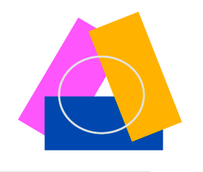
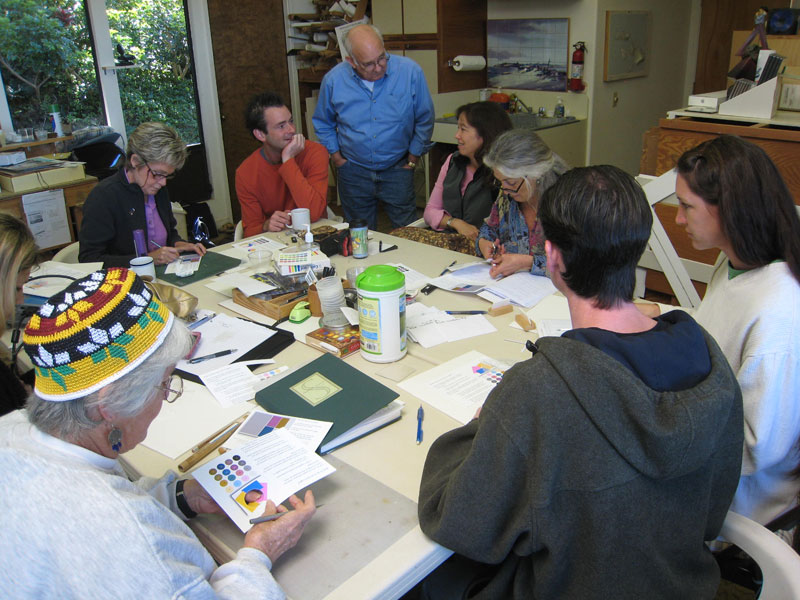
They were given a composition something like this, and told to choose colors (from a set given) which would create the illusion of a veil (such as a piece of tracing paper, or thin fabric) over the elliptical area outlined.
Illusion of a veil
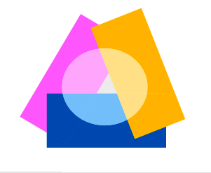
Then they were asked how they would create the illusion of a spotlight on the same composition, and given swatches of color to cut and paste into position. The resulting compositions looked like this:
Illusion of a spotlight
There followed a discussion of the differences between creating the two illusions. A veil lightens, or tints, all colors behind or underneath it. A spotlight causes all areas outside it to appear darker, or shaded (like a film, an earlier subject). What they have in common is their unifying effect on a composition, and they can also create focus, mood, or mystery.
What do these illusions have to do with art? An artist who wants to create a particular mood, or render a particular scene or effect, can use this knowledge to create the effect they want. A misty atmosphere or fog can be thought of as a series of veils. Trees and other objects farther away are lighter, with less contrast to their surroundings. A scene with some brightly lit areas will have other areas of deep shadow. Scenes rendered without this awareness will look flat and false, no matter how realistically drawn.