
A few days ago I made some graphs of data my husband and I have kept for the past three years, of the number of days we’ve windsurfed. What you see below is what I came up with. (Click on any image to see a larger version. Some are PDFs.)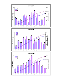
Yes, keeping track of this kind of detail this might seem pretty anal. We’re engineers. But these records help us check our instincts when we comment that this month seems better, or worse, than the same month in past years. However, the original charts were becoming unwieldy. We’d posted them on our refrigerator, and they were fading, and took up too much space.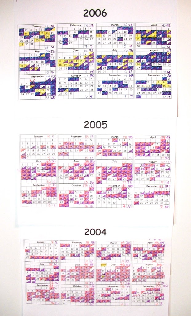
I’m writing about this here because I thought that walking through my thinking, and the process I followed, would be helpful in illustrating the practical aspects of the principles I’ve been studying for the past few years. Anyone who needs to analyze and report data, whether for a high school science report, a professional journal article, or a business presentation, faces a similar process. In any activity, we encounter choices. Knowing the principles relative to the activity allows us to make informed choices. In this case, the choices should lead to a graphical product that its intended audience finds easy to use.
Analytical design
What do I mean by the term I used in this post’s title, analytical design? It is the phrase used by Edward Tufte to describe graphics created to convey information to others. Other terms used for it are information design and information architecture.
In a series of four books, Edward Tufte has compiled examples of good and bad analytical design, and extracted principles that guide it. I won’t try to summarize them all here, but will illustrate some of them as I walk through this example. They guided the choices I made in creating my design.
What is the thinking task?
The first question to ask yourself before starting an analytical design project is “What is the thinking task this display is supposed to help with?” Put yourself in the viewer’s head and imagine what questions s/he would be trying to answer when looking at your finished design. In this case, I knew exactly what the viewer would be looking for, since I am that viewer. The questions I would be asking of this data are things like:
- How many sailing days did we have last March (say)?
- How does that compare with other Marches?
- Can we expect to sail more in April than in March?
- If our friends ask when is the best time to come to sail, what should we advise them?
This is the thinking task that my information display will address.
Consider design options
The original charts, by the density of the colored-in days, provide general “at-a-glance” answers, and our monthly tallies provide the numerical values, but with three years of data we’re probably about at the limit of what we’re willing to wade through. A more concise summary would be nice. A numerical table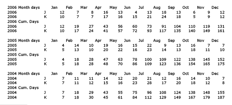
is compact, but hard to comprehend at a glance. A graph would communicate comparisons more quickly. I sketched out three different ways of grouping the data in graphs before settling on one. (I also recognized that in summarizing, I lose some data from the original charts: I won’t be able to answer questions such as “What was the longest run of consecutive sailing days that K had?”. If this kind of question were important, I would make different choices and come up with a different design.)
Refine the design
Then I used Excel’s graphing options to create graphs for each year. My job should be done now, right? Well, not exactly. The Excel charts are quick and easy, but require some tweaking to be most useful. The design should facilitate the thinking task. The default graphs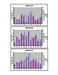
are rather garish and overdone, calling attention to insignificant details while obscuring more important ones. Comparing the default design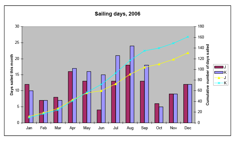
with my variation,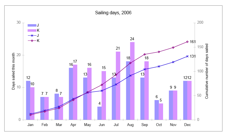
consider these questions:
- Which one is easier to read?
- Which looks more professional?
- Which would you rather present as your work?
I hope you agree that my design is an improvement over the default. (And if not, perhaps you could let me know why.)
One of Tufte’s principles is to let your data speak. Another is to maximize the data-ink ratio. In other words, don’t let non-data elements of the graph, like the background or the grid, overwhelm the data. With these principles in mind, I made the following changes to get from the default design to my final version:
- Remove gray background – improves contrast & readability
- Remove outline around plot area – unnecessary non-data ink
- Change colors of data sets to be more restful (easier to look at) and convey consistent coding (blues for J, purples for K)
- Remove outlines around vertical data bars – unnecessary
- Change symbols for data points – clearer
- Add value labels for data bars and year-end totals – informative
- Standardize vertical scale ranges between years (left axis 0-30, right axis 0-200)
- Move legend inside plot area and remove outline around it – more usable
- Remove bold effect on chart and axis labels – unnecessary
- Scale down font size of chart label (title)
- Tone down axes by changing from black to gray
- Quiet Y-coordinate labeling by increasing size of major divisions
- Tone down outline around each chart
I’m not saying that this version would escape criticism from ET (he presents an elegant re-design of bar charts on p. 128 in The Visual Display of Quantitative Information, 2nd edition). I’m sure it could be improved, and if I were going to submit it to him for a critique, or publish it in a professional journal, I would take more time to refine it. But this version meets the requirements I originally set for it, and looks respectable; it demonstrates that I care about the data and the viewer.
Summary
To summarize, these are the points I have tried to illustrate that apply to designing any informational graphic, such as a chart, table, diagram, or graph, for inclusion in a report, presentation, article, or publication:
- Begin by defining the thinking task(s) the display is to help with – what questions does the viewer care about answering?
- Sketch out some options; evaluate and choose the best one
- Refine the look: Good design is unobtrusive and doesn’t call attention to itself – it facilitates the thinking task.