Category Archives: presentations

VizThink ’09


My husband and I collaborated on a T-shirt design this week, inspired by our plans to attend the VizThink conference later this month. We wanted to show an aspect of why visual thinking is valuable, and exciting to us. We’ll be wearing our long-sleeve Ts at VizThink, and they’re available on CafePress at http://www.cafepress.com/visualthinking/.

The VizThink conference starts in just two weeks, on Feb. 22. It’s two-and-a-half days with some of the world’s leading practitioners of visual thinking and visual communication. Last year’s facilitators included two people – Nancy Duarte and Cliff Atkinson – who, through their work and recently published books, are changing the experience of millions of people who spend much of their time in meetings, by teaching new ways to conceive and design presentations. Dan Roam, another facilitator, shared concepts from his (at the time) soon-to-be-published book, The Back of the Napkin. This book was named one of the top 5 business books of 2008 by Amazon and several business publications. Many of last year’s greats will be returning, and there will be new people with new ideas. It’s sure to be very stimulating for anyone interested in effective visual communication, an increasingly important business skill. (Click on the VizThink08 label to see my posts on last year’s event.)

Beyond Bullet Points


We developed another presentation last week, and I used Cliff Atkinson’s Beyond Bullet Points approach to structure it. It wasn’t a full-on BBP presentation, because a large portion of the time was devoted to working sessions, and because my partner wasn’t that familiar with the approach, but I found it a helpful development tool. The Word template helped me to focus, order, and limit our ideas. I sketched out ideas for some of the slides’ graphics, and actually wound up using some of my crude sketches in the final presentation, as the hand-drawn look, though casual, conveyed the important concepts. I kept a consistent look and theme through the “call to action” and three key point slides.

There were some glitches, but they could be traced to the rushed timeframe and limited review cycle time, rather than the methodology.

The title slide and 8 key BBP slides (Setting, Role, Point A, Point B, Call to Action, and 3 Key Points) are shown above. Get a copy of the BBP Storyboard Sketchpad PDF (below) here. Also see my May 26 post, Walking his talk.

Walking his talk


In the last few days, I’ve been studying the work of Cliff Atkinson. I’ve ordered his book, Beyond Bullet Points, from Amazon. The second edition just came out last year. He has developed a presentation formula that really makes sense to me, using the classic structure of stories to design a presentation. I’ll tell more about that another day.

You’ve probably experienced many PowerPoint presentations in your life, most bad. Cliff co-authored a paper with Richard Mayer, a researcher at UCSB, which gives insight into why they can be so mind-numbing. The fundamental reason is that they don’t correspond to how humans take in and make sense of information.

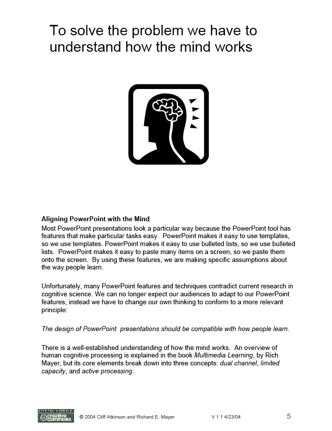
“The design of PowerPoint presentations should be compatible with how people learn.”

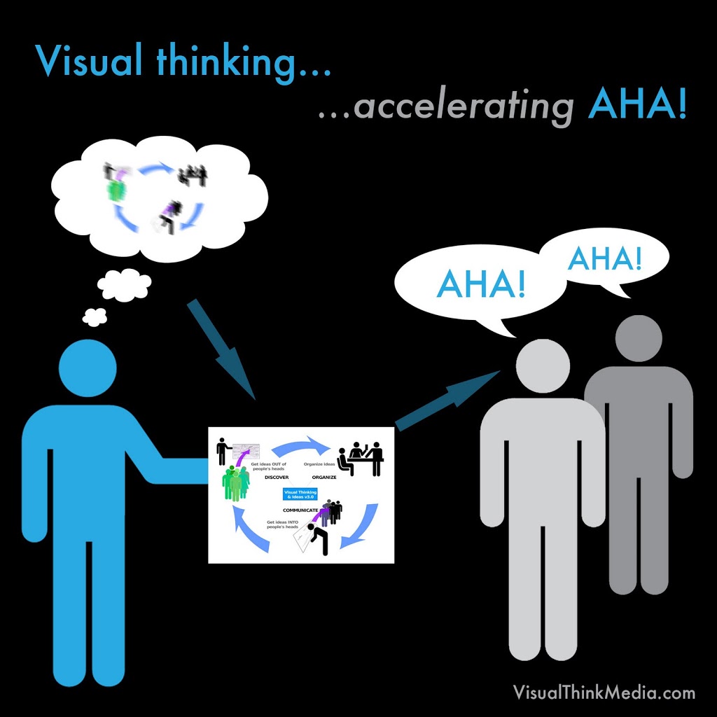
The typical PowerPoint presentation contains slide after slide of text, which the presenter often reads to the audience. Because we have parallel channels for processing visual and verbal input, our verbal channel gets overloaded, reading and translating the written words plus hearing what the speaker says, while our visual channel has little to do (look at the speaker, the room, other audience members) and does not receive any reinforcing input. If a presentation is to inform, the speaker should understand how best to get their message across, which is to use both the visual and the verbal channels. Give the eyes something relevant to look at, and speak the message they are trying to convey. As Bob Horn says, let words do what they do best, and let pictures do what they do best. By stimulating both channels, the brain automatically seeks to make connections between the new information in the presentation, and relate it to existing knowledge.

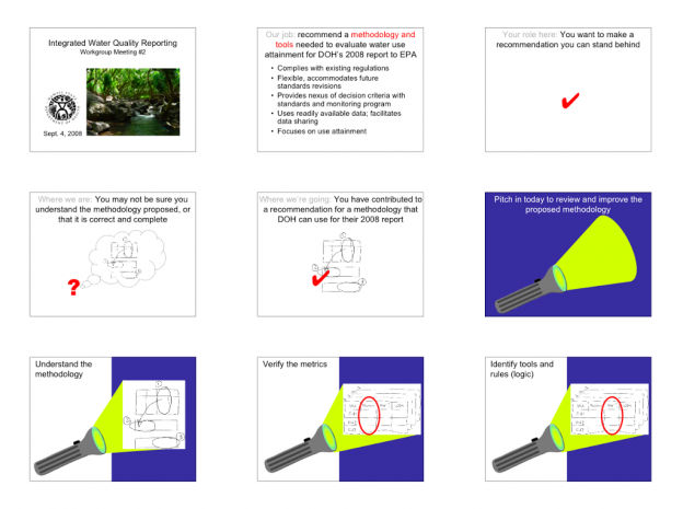
What I mean by “walking his talk” is that this paper exemplifies the format that Cliff recommends for presentations. It is a “notes page” view handout from PowerPoint, which shows the slide on the top of the page, and the speaker’s notes or narration on the bottom half. You can see that there is an engaging graphic on the slide, with a headline that summarizes the current topic, and useful details are given in the narration. The paper, in PDF, is “Five ways to reduce PowerPoint overload”. This is one of the most succinct and informative explanations I’ve seen about why to use visual communication, and how to do it effectively.

Cliff’s websites are well worth exploring. There is one for each version of the book. The new site is a focus for a “Beyond Bullet Points” online learning community, so much of the content is restricted to members (currently $25 annually), but there are still a lot of free resources, including PDF downloads of chapters 2 and 3 of the new book, and templates for Word and PowerPoint. Here is Cliff’s new website, corresponding to the 2007 edition of the book. The older website represents his business, Sociable Media, and also has chapter and template downloads, plus a lot of articles and interviews, and an archived forum (new discussion is moved to the new site). Here is the website corresponding to the 2005 edition of the book. I invite you to explore these resources to find inspiration, rationale, and tools for improving any presentation you may need to give.

Working!


Wow, it’s been over two months since my last post. Like many bloggers, that means I’ve been busy with higher priority, i.e., rent-paying, things. Plus, I feel more comfortable posting finished work and considered thoughts, rather than ramble about raw work in progress. So today, I’m posting links to some of what I’ve been working on lately.

A couple weeks ago, I went to Oahu for a meeting on a Clean Water Act water quality project with the state Department of Health. The lead contractor on the project is a woman named Robin Knox, who has water quality expertise, and she asked me to partner with her to help create informative graphics and facilitate the workgroup meetings we will be convening. She gave a repeat performance on Maui today. This PDF is a good summary of the project, and the purpose of the meeting. Our presentation (PowerPoint file, with speaker’s notes) is here. Both, plus a handout, are linked from this web page (scroll down a ways until you see a little yellow “New” flag and “May 7”.) Next steps are to convene working groups for two more meetings and to submit a report of the group’s recommendations.