Category Archives: visual communication

Elephant Egg 5


I was one of 5 presenters at the latest Elephant Egg event on Oct. 22. This was the best one yet, in my opinion. None of the presenters used bullet points, or read us their slides! In fact, all used the medium in the way recent research says is most effective: the visual content on the slide and the presenters’ spoken comments complement and support each other.

Barking
“Dr. Kate” Kathleen Ireland, a science teacher at Seabury school, shared her experience of the trip of a lifetime, going to the Galapagos Islands with other teachers. She told us how excited she was when her application was accepted: she felt like Charlie, in Charlie and the Chocolate Factory, winning the golden ticket. She told us that all the animals, and even the people, bark, and used that as a metaphor for getting people’s attention to recycling and other ecological concerns.

Uncovering Pa`u
Linda Lindsay gave a graceful and dignified presentation about her current film project, a documentary about the pa`u riders – Hawaiian women who ride horses – and their traditions, a piece of Hawaiian culture that few are aware of. You can follow her work by becoming a fan of her Facebook page.

Visual Language

(Click to view a video of my presentation on YouTube. I’m mostly a silhouette in the shadows, but the presentation and audio are pretty clear.)

My presentation had an audacious goal: to teach the audience a new language! I provided a worksheet to make it an active learning experience and was pleased to see almost everyone participating. Having a table full of friends to support me made it so much easier to make my first public presentation – thanks for being there for me, Jeff, Jeff, Francine, Ann, and Don! And thanks to Gabe, who couldn’t be there, but suggested doing the video.

Here’s the presentation on Slideshare, if you’d like to review it or read through at your own pace.

Wander
Paul Wood, a writer and educator, did a multi-media performance piece accompanied by music by Duke Ellington, commenting poignantly on a current issue, the diversion and restoration of Maui stream water.

Maui forest birds
Mike Neal came to Maui years ago to surf, but has recently discovered a new passion in the cloud forests on the slopes above us, photographing and working to preserve native birds of Maui. These birds are extremely rare, with only a few hundred individuals (of some species) surviving in the world.


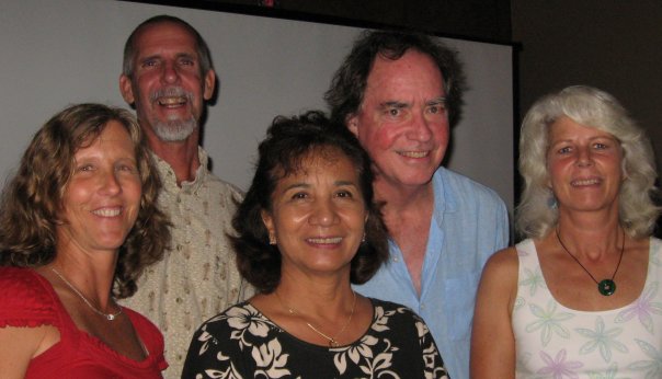
The presenters, from left to right: Kathleen Ireland, Mike Neal, Linda Lindsay, Paul Wood, Karen Bennett.

Thanks again to Maggie Sutrov and Ian Blakeslee for organizing this evening of inspiration! They are planning another event next month which promises to be fascinating: The Reverse Origami Film Festival, which will feature short (5 minutes or less) videos by Maui film makers, on Nov. 21.

Simple pictures for complicated situations

“Solving problems and selling ideas with pictures.”

That’s the subtitle of Dan Roam’s best-selling business book, The Back of the Napkin. Wait, did you say business book? That sounds like a pretty “lite” title for a business book. Well, a book doesn’t have to be ponderous or dense to be useful. In fact, the more accessible, the more likely the ideas will be considered and adopted. Dan’s book is clear and well-organized, teaching how to use visual thinking to analyze business problems and communicate clearly about them.
Political issues rarely get this kind of treatment. Buzz words and emotion rule, with little rational analysis or explanation for the average citizen. Dan and a doctor decided to provide some perspective on the current health care reform debate. He posted a 4-part presentation on his blog, using simple hand drawings, to explain the factors involved, the types of proposals being considered, and how individuals will be affected under each. It was such a breath of fresh air that Fox News had him go through some of it on-air, and Business Week magazine and Slideshare.net named it the best presentation of 2009 in a recent contest.
Another example of the power of a simple drawing is the “rich picture.” I learned about these a few years ago. Last week, Dave Lash turned me on to a useful diagramming tutorial site which is part of a university-level systems thinking curriculum. For 6 different diagram types, self-paced Flash movies explain when each is most useful and how to draw them. Transcripts of the narration are also provided.

A rich picture is a sort of hand-drawn info-graphic, used in the very early stages of an analysis to explore the issue and surface assumptions. This diagram examines a controversial situation in England a few years ago. Here are some comments on the diagram by its creator, from the accompanying transcript (I’ve emphasized some points that make rich pictures so valuable, in my view):
I don’t think rich pictures can be used to depict everything in a problem situation, I think they are devices for some kind of discrimination – you are actually saying what you think are the important issues, and you have to decide on what’s important according to the purpose the rich picture is being constructed for, for a particular problem situation.

In this case my purpose was just to try and gain a general understanding about the miners’ situation.

It can be used as a personal device, so you can explore your own understanding. When you begin to put symbols down on paper and to draw the rich picture, you begin to question your own understanding and it can throw up questions for yourself about what you understand and what you don’t understand. It begins to put some structure on the problem situation from your own personal perspective.

It’s probably got a number of faults in it, and I think that’s one of the strengths of a rich picture. It makes you begin to declare assumptions, and because you are declaring and discussing those assumptions, they can be challenged by other people. So your understanding of the situation can be explored, challenged and modified by the debate that ensues. The power of a rich picture is that it provokes that kind of debate, there’s a bit of visual interest there that can spark off thought, you can visit the rich picture randomly, you can move around on it which is stimulating for debate in itself.
I haven’t had a chance to go through all the diagram tutorials in detail yet, because I’m preparing a presentation for the next Elephant Egg night. (In developing this presentation, I’m experimenting with the methodologies of Cliff Atkinson and Andrew Abela, who have both recently published excellent books aimed at helping people communicate more clearly in presentations.) If you’re on Maui, you might enjoy stopping by Moana Cafe on Thursday, October 22 at 6:30 for an evening of serendipity and new ideas!

Cool tool


Today I discovered a new free tool that I think will be very helpful. It’s called Jing, and you can use it to capture, annotate, and share screen shots, and make short videos of your screen. I captured the image above from their website, and added their tag line, “Visual conversation starts here”, in the blue annotations. The intuitive interface lets you highlight or frame areas in the image, and use arrows to point to areas of interest. You control the colors, fonts, and sizes.

Here’s a 34-second screen capture video:

Walking his talk


In the last few days, I’ve been studying the work of Cliff Atkinson. I’ve ordered his book, Beyond Bullet Points, from Amazon. The second edition just came out last year. He has developed a presentation formula that really makes sense to me, using the classic structure of stories to design a presentation. I’ll tell more about that another day.

You’ve probably experienced many PowerPoint presentations in your life, most bad. Cliff co-authored a paper with Richard Mayer, a researcher at UCSB, which gives insight into why they can be so mind-numbing. The fundamental reason is that they don’t correspond to how humans take in and make sense of information.

“The design of PowerPoint presentations should be compatible with how people learn.”

The typical PowerPoint presentation contains slide after slide of text, which the presenter often reads to the audience. Because we have parallel channels for processing visual and verbal input, our verbal channel gets overloaded, reading and translating the written words plus hearing what the speaker says, while our visual channel has little to do (look at the speaker, the room, other audience members) and does not receive any reinforcing input. If a presentation is to inform, the speaker should understand how best to get their message across, which is to use both the visual and the verbal channels. Give the eyes something relevant to look at, and speak the message they are trying to convey. As Bob Horn says, let words do what they do best, and let pictures do what they do best. By stimulating both channels, the brain automatically seeks to make connections between the new information in the presentation, and relate it to existing knowledge.

What I mean by “walking his talk” is that this paper exemplifies the format that Cliff recommends for presentations. It is a “notes page” view handout from PowerPoint, which shows the slide on the top of the page, and the speaker’s notes or narration on the bottom half. You can see that there is an engaging graphic on the slide, with a headline that summarizes the current topic, and useful details are given in the narration. The paper, in PDF, is “Five ways to reduce PowerPoint overload”. This is one of the most succinct and informative explanations I’ve seen about why to use visual communication, and how to do it effectively.

Cliff’s websites are well worth exploring. There is one for each version of the book. The new site is a focus for a “Beyond Bullet Points” online learning community, so much of the content is restricted to members (currently $25 annually), but there are still a lot of free resources, including PDF downloads of chapters 2 and 3 of the new book, and templates for Word and PowerPoint. Here is Cliff’s new website, corresponding to the 2007 edition of the book. The older website represents his business, Sociable Media, and also has chapter and template downloads, plus a lot of articles and interviews, and an archived forum (new discussion is moved to the new site). Here is the website corresponding to the 2005 edition of the book. I invite you to explore these resources to find inspiration, rationale, and tools for improving any presentation you may need to give.

Art & science


In Dick’s color class Tuesday we were exploring colored light, and talking about the difference in colors between sunset and sunrise. Kit Gentry proposed a theory about more color at sunset due to more moisture and particulates in the air. I confirmed this later in The Nature of Light and Colour in the Open Air, by Marcel Minnaert. I was reminded again of the common drives shared by artists and scientists, curiosity and exploration, and their common disciplines of observation and experimentation.

I love this quote from Edward Tufte, because it helps me make sense of my parallel interests:

“Science and art have in common intense seeing, the wide-eyed observing that generates empirical information.”

(from Beautiful Evidence, 2006, p. 9)

Artists and scientists used to be the same person – daVinci, Goethe – the modern gulf between them is artificial and detrimental. This is one of the ideas of Dan Pink’s A Whole New Mind: We need to unite these world views. Dick’s class does. It teaches artists to see more carefully and scientifically, and shows how this rational approach can enhance their creativity.

This is why I’m so excited about visual thinking and visual communication – it is consistent with more of who we are.

(Photo by Kit Gentry)