Category Archives: visual thinking

The fox and the hummingbird: new thinking from Dan Roam

There’s no VizThink conference this year, but a lot of the visual thinking crowd is at SxSW in Austin, Texas, right now, and I’ve been “virtually there” by following their tweets (status updates) on Twitter. Dan Roam spoke there today, and some of the comments about his talk, “Blah Blah Blah: Why Words Won’t Work” were:

  • One of the smartest guys I’ve heard speak.
  • This is probably the best presentation I’ve ever seen. Ever.
  • Hands down best preso I’ve attended so far.
  • He could be the smartest guy on the planet.
Interesting that a great speaker and presenter used a lot of visuals and was perceived to be very smart! Could it be that he’s onto something?
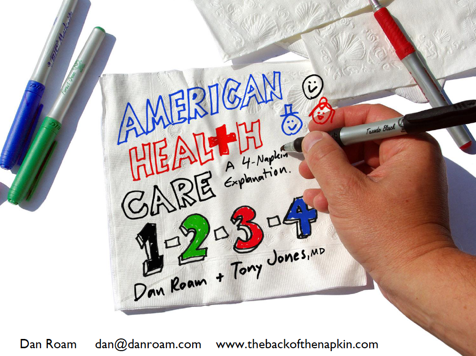
A lot of tweets repeated concepts that were familiar to me from his two excellent books, The Back of the Napkin and Unfolding the Napkin, but I was intrigued by some new ideas.
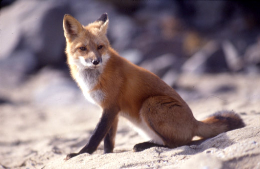
More and more people are familiar with the concept of left brain and right brain, and their different strengths. He’s got an updated version of that concept for distinguishing between our verbal mind and our visual mind. He likens the verbal mind to a fox – clever, linear, analyzing – and the visual mind to a hummingbird – spatial, spontaneous, and synthesizing.
I don’t know much about foxes or hummingbirds, but it will be interesting to see how he uses and develops this idea. Here’s a short YouTube video of each:

Another new mnemonic he introduced was “ViVID” thinking: Visual-Verbal Inter-Dependent thinking. Despite the title of his talk, Why Words Won’t Work, he’s not against words; he thinks we need to use both words and pictures in order to thoroughly explore and share ideas. “ViVID” encapsulates that idea brilliantly. There was even a suggestion that he’s working on a new book, to be titled Vivid Thinking.
Check out the original tweets by searching Twitter for the hashtag #whywordswontwork .
Dan is a great voice for visual thinking, and, thanks in large part to him, the business world and wider public are starting to wake up to its value. I’ll be watching Dan’s blog, and any other public appearances, for more.

Simple pictures for complicated situations

“Solving problems and selling ideas with pictures.”

That’s the subtitle of Dan Roam’s best-selling business book, The Back of the Napkin. Wait, did you say business book? That sounds like a pretty “lite” title for a business book. Well, a book doesn’t have to be ponderous or dense to be useful. In fact, the more accessible, the more likely the ideas will be considered and adopted. Dan’s book is clear and well-organized, teaching how to use visual thinking to analyze business problems and communicate clearly about them.
Political issues rarely get this kind of treatment. Buzz words and emotion rule, with little rational analysis or explanation for the average citizen. Dan and a doctor decided to provide some perspective on the current health care reform debate. He posted a 4-part presentation on his blog, using simple hand drawings, to explain the factors involved, the types of proposals being considered, and how individuals will be affected under each. It was such a breath of fresh air that Fox News had him go through some of it on-air, and Business Week magazine and Slideshare.net named it the best presentation of 2009 in a recent contest.
Another example of the power of a simple drawing is the “rich picture.” I learned about these a few years ago. Last week, Dave Lash turned me on to a useful diagramming tutorial site which is part of a university-level systems thinking curriculum. For 6 different diagram types, self-paced Flash movies explain when each is most useful and how to draw them. Transcripts of the narration are also provided.

A rich picture is a sort of hand-drawn info-graphic, used in the very early stages of an analysis to explore the issue and surface assumptions. This diagram examines a controversial situation in England a few years ago. Here are some comments on the diagram by its creator, from the accompanying transcript (I’ve emphasized some points that make rich pictures so valuable, in my view):
I don’t think rich pictures can be used to depict everything in a problem situation, I think they are devices for some kind of discrimination – you are actually saying what you think are the important issues, and you have to decide on what’s important according to the purpose the rich picture is being constructed for, for a particular problem situation.

In this case my purpose was just to try and gain a general understanding about the miners’ situation.

It can be used as a personal device, so you can explore your own understanding. When you begin to put symbols down on paper and to draw the rich picture, you begin to question your own understanding and it can throw up questions for yourself about what you understand and what you don’t understand. It begins to put some structure on the problem situation from your own personal perspective.

It’s probably got a number of faults in it, and I think that’s one of the strengths of a rich picture. It makes you begin to declare assumptions, and because you are declaring and discussing those assumptions, they can be challenged by other people. So your understanding of the situation can be explored, challenged and modified by the debate that ensues. The power of a rich picture is that it provokes that kind of debate, there’s a bit of visual interest there that can spark off thought, you can visit the rich picture randomly, you can move around on it which is stimulating for debate in itself.
I haven’t had a chance to go through all the diagram tutorials in detail yet, because I’m preparing a presentation for the next Elephant Egg night. (In developing this presentation, I’m experimenting with the methodologies of Cliff Atkinson and Andrew Abela, who have both recently published excellent books aimed at helping people communicate more clearly in presentations.) If you’re on Maui, you might enjoy stopping by Moana Cafe on Thursday, October 22 at 6:30 for an evening of serendipity and new ideas!

Art & science


In Dick’s color class Tuesday we were exploring colored light, and talking about the difference in colors between sunset and sunrise. Kit Gentry proposed a theory about more color at sunset due to more moisture and particulates in the air. I confirmed this later in The Nature of Light and Colour in the Open Air, by Marcel Minnaert. I was reminded again of the common drives shared by artists and scientists, curiosity and exploration, and their common disciplines of observation and experimentation.

I love this quote from Edward Tufte, because it helps me make sense of my parallel interests:

“Science and art have in common intense seeing, the wide-eyed observing that generates empirical information.”

(from Beautiful Evidence, 2006, p. 9)

Artists and scientists used to be the same person – daVinci, Goethe – the modern gulf between them is artificial and detrimental. This is one of the ideas of Dan Pink’s A Whole New Mind: We need to unite these world views. Dick’s class does. It teaches artists to see more carefully and scientifically, and shows how this rational approach can enhance their creativity.

This is why I’m so excited about visual thinking and visual communication – it is consistent with more of who we are.

(Photo by Kit Gentry)